
In accordance with local regulations, information on Stage 1 Infant Formula is restricted. Please consult your healthcare professional.

CRENA Ultimate
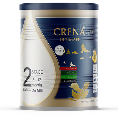
CRENA Ultimate Stage 2
CRENA Ultimate

The Complete Suite for
Their Brightest Future.

Our flagship formula. CRENA Ultimate combines the full premium bioactive suite—including MFGM, HMOs, OPO, and Lactoferrin—alongside our gentle AMF base.

🏆 Flagship Formula 🧠 MFGM + HMOs + Lactoferrin 🥇 AMF + OPO

Stage 2: Follow-On Formula

6–12 Months

Why Choose This Stage?

Growing with ultimate support. As your baby explores solid foods, their nutritional demands shift. Stage 2 increases protein density to support rapid lean body mass accretion, while maintaining the full, unbroken suite of MFGM, HMOs, Lactoferrin, and OPO.

Key Nutritional Highlights

Energy~486 kcal
Protein13.3 g (Increased)
Fat24.5 g (AMF + 1.5g OPO)
MFGM150 mg
HMOs240 mg (2'-FL & LNnT)
Lactoferrin30 mg
DHA / ARA140 mg | ≥180 mg
Enhanced GOS/FOS3.29 g

Preparation Guide

Reconstitution: 13 g powder + water to 100 mL

Instant solubility — no clumping, no fuss

Choose Your Format

Available in three convenient formats to suit your lifestyle.

400g Tin

Best For: Ideal for travel, trial, or on-the-go

Preparation: 13g powder + water to 100mL

Find in Store →

The Pinnacle of Nutritional Science

CRENA Ultimate doesn't just include a few premium ingredients; it delivers the complete, synergistic suite of advanced bioactives.

Cognitive Architecture

MFGM & HMOs

Features MFGM alongside HMOs (2'-FL & LNnT) to support cognitive foundations and natural immune defenses.

Advanced Immune Support

Lactoferrin

Exclusive to our Ultimate range, Lactoferrin (30 mg) is a premium protein naturally found in breast milk.

Gut-Brain Harmony

OPO & Enhanced Prebiotics

Enriched with OPO and Enhanced GOS/FOS prebiotics to support your baby's developing digestive system.

The AMF Advantage

Nature's Own Fat Profile

Enriched with premium Anhydrous Milk Fat (AMF)—restoring the familiar lipid profile found in breast milk.

Elevated DHA/ARA

Instant Solubility

Delivers elevated levels of DHA and ARA alongside our clean-label formulation that dissolves instantly.

Is Ultimate the Right Fit for Your Baby?

Explore our tailored ranges to find the exact nutrition your baby needs.

Feature CRENA™ Basic CRENA™ Comfort CRENA™ Neuro-Comfort CRENA™ Ultimate
Best For Everyday complete nutrition Sensitive tummies Advanced Brain + Gentle Tummy The Complete Premium Suite
Protein Type Intact (60/40) Intact (60/40) Intact (60/40) Intact (60/40)
Key Fat Profile AMF AMF + OPO AMF + OPO AMF + OPO
Prebiotic Fibre Standard (1.26g) Enhanced (2.19g) Enhanced (3.29g) Enhanced (3.29g)
Premium Bioactives Standard DHA/ARA Standard DHA/ARA MFGM, HMOs, Elevated DHA/ARA MFGM, HMOs, Lactoferrin, Elevated DHA/ARA
Explore → Explore → Explore →
/* ============================================================ FOOTER — Complete Responsive /assets/css/components/footer.css ============================================================ */ /* ─── Corporate Footer ─── */ .corporate-footer { background: #003366; color: #FFFFFF; padding: 60px 0 24px; margin-top: 60px; width: 100%; } .corporate-footer .container { max-width: 1280px; margin: 0 auto; padding: 0 24px; } /* ─── Footer Grid ─── */ .corporate-footer .footer-grid { display: grid; grid-template-columns: 2fr 1fr 1fr 1.5fr; gap: 40px; margin-bottom: 32px; padding-bottom: 32px; border-bottom: 1px solid rgba(255,255,255,0.08); } /* ─── Brand Column ─── */ .corporate-footer .footer-brand { display: flex; flex-direction: column; } .corporate-footer .footer-logo { height: 48px; width: auto; margin-bottom: 12px; filter: brightness(0) invert(1); } .corporate-footer .footer-tagline { color: rgba(255,255,255,0.7); font-size: 14px; line-height: 1.6; margin: 0; font-family: 'Inter', sans-serif; } /* ─── Footer Links ─── */ .corporate-footer .footer-heading { color: #FFFFFF; font-size: 14px; font-weight: 600; margin-bottom: 12px; font-family: 'Inter', sans-serif; letter-spacing: 0.5px; text-transform: uppercase; } .corporate-footer .footer-links ul { list-style: none; padding: 0; margin: 0; } .corporate-footer .footer-links ul li { margin-bottom: 8px; } .corporate-footer .footer-links ul li a { color: rgba(255,255,255,0.6); text-decoration: none; font-size: 14px; transition: all 0.2s ease; font-family: 'Inter', sans-serif; } .corporate-footer .footer-links ul li a:hover { color: #FFFFFF; padding-left: 4px; } /* ─── Newsletter ─── */ .corporate-footer .footer-newsletter { display: flex; flex-direction: column; } .corporate-footer .footer-newsletter .newsletter-text { color: rgba(255,255,255,0.7); font-size: 14px; line-height: 1.6; margin-bottom: 12px; font-family: 'Inter', sans-serif; } .corporate-footer .footer-newsletter .newsletter-form { display: flex; gap: 8px; width: 100%; } .corporate-footer .footer-newsletter .newsletter-form input[type="email"] { flex: 1; padding: 10px 14px; border-radius: 8px; border: 1px solid rgba(255,255,255,0.15); background: rgba(255,255,255,0.06); color: #FFFFFF; font-size: 14px; font-family: 'Inter', sans-serif; min-height: 44px; transition: border-color 0.2s ease; } .corporate-footer .footer-newsletter .newsletter-form input[type="email"]::placeholder { color: rgba(255,255,255,0.4); } .corporate-footer .footer-newsletter .newsletter-form input[type="email"]:focus { outline: none; border-color: #C47B2E; } .corporate-footer .footer-newsletter .newsletter-form .btn-small { padding: 10px 24px; font-size: 13px; font-weight: 600; border-radius: 8px; background: #C47B2E; color: #FFFFFF; border: none; cursor: pointer; transition: all 0.2s ease; white-space: nowrap; min-height: 44px; flex-shrink: 0; font-family: 'Inter', sans-serif; } .corporate-footer .footer-newsletter .newsletter-form .btn-small:hover { background: #A85F1E; transform: translateY(-2px); } /* ─── Address Bar ─── */ .corporate-footer .footer-address-corporate { padding: 16px 0; border-top: 1px solid rgba(255,255,255,0.08); border-bottom: 1px solid rgba(255,255,255,0.08); margin: 16px 0 20px; } .corporate-footer .footer-address-corporate .address-item { display: flex; align-items: center; justify-content: center; gap: 10px; text-align: center; flex-wrap: wrap; } .corporate-footer .footer-address-corporate .address-item i { color: rgba(255,255,255,0.5); font-size: 18px; } .corporate-footer .footer-address-corporate .address-item span { color: rgba(255,255,255,0.6); font-size: 13px; font-family: 'Inter', sans-serif; } .corporate-footer .footer-address-corporate .address-item strong { color: #FFFFFF; font-weight: 600; } /* ─── Footer Bottom ─── */ .corporate-footer .footer-bottom { border-top: 1px solid rgba(255,255,255,0.08); padding-top: 24px; display: flex; justify-content: space-between; align-items: center; flex-wrap: wrap; gap: 16px; } .corporate-footer .footer-bottom .legal-links { list-style: none; display: flex; gap: 24px; flex-wrap: wrap; padding: 0; margin: 0; } .corporate-footer .footer-bottom .legal-links a { color: rgba(255,255,255,0.5); font-size: 12px; text-decoration: none; font-family: 'Inter', sans-serif; transition: color 0.2s ease; } .corporate-footer .footer-bottom .legal-links a:hover { color: #FFFFFF; } .corporate-footer .footer-bottom .footer-copyright { color: rgba(255,255,255,0.3); font-size: 12px; margin: 0; font-family: 'Inter', sans-serif; } /* ============================================================ RESPONSIVE — Footer ============================================================ */ /* ─── Tablet (1024px) ─── */ @media (max-width: 1024px) { .corporate-footer .footer-grid { grid-template-columns: 1fr 1fr; gap: 32px; } } /* ─── Mobile (768px) ─── */ @media (max-width: 768px) { .corporate-footer { padding: 40px 0 20px; margin-top: 40px; } .corporate-footer .container { padding: 0 16px; } .corporate-footer .footer-grid { grid-template-columns: 1fr; gap: 24px; padding-bottom: 24px; } .corporate-footer .footer-brand { text-align: center; align-items: center; } .corporate-footer .footer-logo { height: 40px; } .corporate-footer .footer-heading { text-align: center; font-size: 15px; } .corporate-footer .footer-links ul { text-align: center; } .corporate-footer .footer-links ul li { margin-bottom: 6px; } .corporate-footer .footer-newsletter { align-items: center; text-align: center; } .corporate-footer .footer-newsletter .newsletter-text { font-size: 13px; text-align: center; } .corporate-footer .footer-newsletter .newsletter-form { flex-direction: column; max-width: 400px; margin: 0 auto; width: 100%; } .corporate-footer .footer-newsletter .newsletter-form input[type="email"] { width: 100%; min-height: 40px; font-size: 13px; } .corporate-footer .footer-newsletter .newsletter-form .btn-small { width: 100%; justify-content: center; min-height: 40px; font-size: 13px; } .corporate-footer .footer-address-corporate { padding: 12px 0; margin: 12px 0 16px; } .corporate-footer .footer-address-corporate .address-item { flex-direction: column; gap: 4px; } .corporate-footer .footer-address-corporate .address-item span { font-size: 12px; text-align: center; } .corporate-footer .footer-bottom { flex-direction: column; align-items: center; text-align: center; gap: 12px; padding-top: 16px; } .corporate-footer .footer-bottom .legal-links { justify-content: center; gap: 16px; } .corporate-footer .footer-bottom .legal-links a { font-size: 11px; } .corporate-footer .footer-bottom .footer-copyright { font-size: 11px; } } /* ─── Extra Small (480px) ─── */ @media (max-width: 480px) { .corporate-footer { padding: 32px 0 16px; } .corporate-footer .footer-grid { gap: 20px; } .corporate-footer .footer-logo { height: 34px; } .corporate-footer .footer-tagline { font-size: 13px; } .corporate-footer .footer-links ul li a { font-size: 13px; } .corporate-footer .footer-newsletter .newsletter-text { font-size: 12px; } .corporate-footer .footer-newsletter .newsletter-form input[type="email"] { min-height: 36px; font-size: 12px; padding: 8px 12px; } .corporate-footer .footer-newsletter .newsletter-form .btn-small { min-height: 36px; font-size: 12px; padding: 8px 16px; } .corporate-footer .footer-address-corporate .address-item span { font-size: 11px; } .corporate-footer .footer-bottom .legal-links { gap: 12px; flex-wrap: wrap; } .corporate-footer .footer-bottom .legal-links a { font-size: 10px; } .corporate-footer .footer-bottom .footer-copyright { font-size: 10px; } }