
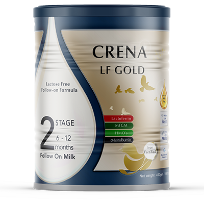
CRENA LF GOLD
CRENA LF GOLD Stage 2
🩺Specialized Premium Formula — FSMP
CRENA LF GOLD

100% Lactose-Free Comfort Meets
Advanced Cognitive Support.

Specially formulated for the dietary management of lactose intolerance. Combines our gentle, 100% lactose-free base with the complete premium bioactive suite.

🚫 100% Lactose-Free 🧠 MFGM + HMOs + Lactoferrin 🥇 AMF + OPO
⚠️

MEDICAL NOTICE

This formula is intended for the dietary management of lactose intolerance under medical supervision.

  • NOT suitable for infants with galactosemia.
  • Contains milk proteins — NOT suitable for infants with Cow's Milk Protein Allergy (CMPA).
  • Exclusive to LF GOLD: Includes MFGM, HMOs, and Lactoferrin for premium cognitive and immune support.
  • Always consult your pediatrician or healthcare provider.

Stage 2: Lactose-Free Premium Follow-On Formula

6–12 Months

Why Choose This Stage?

Continued premium support during weaning. As your baby explores complementary foods, Stage 2 provides increased protein density for rapid growth. The 100% lactose-free base, combined with OPO, MFGM, HMOs, and Lactoferrin.

Key Nutritional Highlights

Energy~486 kcal
Protein13.2 g (Increased)
Fat24.5 g (AMF + 1.5g OPO)
Lactose<0.1 g (100% Free)
MFGM150 mg
HMOs240 mg (2'-FL & LNnT)
Lactoferrin30 mg
DHA / ARA140 mg | ≥180 mg
Plant-Based P-GOS4.42 g

Preparation Guide

Reconstitution: 13 g powder + water to 100 mL

Instant solubility — no clumping, no fuss

Choose Your Format

Available in two convenient tin sizes.

800g Tin

Best For: The standard everyday size with freshness seal

Preparation: 13g powder + water to 100mL

Find in Store →

The Pinnacle of Lactose-Free Nutritional Science

When lactose causes digestive distress, your baby still deserves the highest level of cognitive and immune support.

100% Lactose-Free Base

Plant-Based Prebiotics

Lactose is completely replaced with gentle corn maltodextrin. We utilize P-GOS®, a unique plant-based prebiotic fibre derived from peas.

Complete Premium Bioactive Suite

MFGM + HMOs + Lactoferrin

Exclusive to our LF GOLD range, this formula includes MFGM, HMOs (2'-FL & LNnT), and Lactoferrin (30 mg).

Gentle Proteins & AMF

Nature's Own Fat Profile

Formulated with Whey Protein Isolate and Casein Isolate. Enriched with premium Anhydrous Milk Fat (AMF).

⚠️ Contains milk proteins. Not suitable for CMPA.

Smart Fat Structure

OPO & Instant Solubility

Features OPO (1.5g/100g), a specialized plant-derived fat structure that mimics natural breast milk fats.

Is CRENA LF GOLD the Right Fit?

Specialized formulas target different digestive challenges. Please consult your healthcare professional to find the exact nutrition your baby needs.

Feature CRENA LF CRENA LF GOLD CRENA HA CRENA HA GOLD
Best For Lactose Intolerance (Standard) Lactose Intolerance + Premium Brain/Immune Cow's Milk Protein Allergy (CMPA) CMPA + Premium Immune Support
Protein Type Intact (WPI & Casein Isolate) Intact (WPI & Casein Isolate) Extensively Hydrolyzed Extensively Hydrolyzed
Lactose Content <0.1 g (Lactose-Free) <0.1 g (Lactose-Free) Contains Lactose Contains Lactose
Key Fat Profile AMF + OPO AMF + OPO AMF AMF + OPO
Premium Bioactives Standard DHA/ARA MFGM, HMOs, Lactoferrin, Elevated DHA/ARA Standard DHA/ARA HMOs (2'-FL, LNnT), Elevated DHA/ARA
Prebiotic Fibre Plant-Based P-GOS (0.66g) Plant-Based P-GOS (Enhanced 4.42g) Dairy-based GOS/FOS (0.49g) Dairy-based GOS/FOS (Enhanced)
Explore LF → Explore HA → Explore HA GOLD →
/* ============================================================ FOOTER — Complete Responsive /assets/css/components/footer.css ============================================================ */ /* ─── Corporate Footer ─── */ .corporate-footer { background: #003366; color: #FFFFFF; padding: 60px 0 24px; margin-top: 60px; width: 100%; } .corporate-footer .container { max-width: 1280px; margin: 0 auto; padding: 0 24px; } /* ─── Footer Grid ─── */ .corporate-footer .footer-grid { display: grid; grid-template-columns: 2fr 1fr 1fr 1.5fr; gap: 40px; margin-bottom: 32px; padding-bottom: 32px; border-bottom: 1px solid rgba(255,255,255,0.08); } /* ─── Brand Column ─── */ .corporate-footer .footer-brand { display: flex; flex-direction: column; } .corporate-footer .footer-logo { height: 48px; width: auto; margin-bottom: 12px; filter: brightness(0) invert(1); } .corporate-footer .footer-tagline { color: rgba(255,255,255,0.7); font-size: 14px; line-height: 1.6; margin: 0; font-family: 'Inter', sans-serif; } /* ─── Footer Links ─── */ .corporate-footer .footer-heading { color: #FFFFFF; font-size: 14px; font-weight: 600; margin-bottom: 12px; font-family: 'Inter', sans-serif; letter-spacing: 0.5px; text-transform: uppercase; } .corporate-footer .footer-links ul { list-style: none; padding: 0; margin: 0; } .corporate-footer .footer-links ul li { margin-bottom: 8px; } .corporate-footer .footer-links ul li a { color: rgba(255,255,255,0.6); text-decoration: none; font-size: 14px; transition: all 0.2s ease; font-family: 'Inter', sans-serif; } .corporate-footer .footer-links ul li a:hover { color: #FFFFFF; padding-left: 4px; } /* ─── Newsletter ─── */ .corporate-footer .footer-newsletter { display: flex; flex-direction: column; } .corporate-footer .footer-newsletter .newsletter-text { color: rgba(255,255,255,0.7); font-size: 14px; line-height: 1.6; margin-bottom: 12px; font-family: 'Inter', sans-serif; } .corporate-footer .footer-newsletter .newsletter-form { display: flex; gap: 8px; width: 100%; } .corporate-footer .footer-newsletter .newsletter-form input[type="email"] { flex: 1; padding: 10px 14px; border-radius: 8px; border: 1px solid rgba(255,255,255,0.15); background: rgba(255,255,255,0.06); color: #FFFFFF; font-size: 14px; font-family: 'Inter', sans-serif; min-height: 44px; transition: border-color 0.2s ease; } .corporate-footer .footer-newsletter .newsletter-form input[type="email"]::placeholder { color: rgba(255,255,255,0.4); } .corporate-footer .footer-newsletter .newsletter-form input[type="email"]:focus { outline: none; border-color: #C47B2E; } .corporate-footer .footer-newsletter .newsletter-form .btn-small { padding: 10px 24px; font-size: 13px; font-weight: 600; border-radius: 8px; background: #C47B2E; color: #FFFFFF; border: none; cursor: pointer; transition: all 0.2s ease; white-space: nowrap; min-height: 44px; flex-shrink: 0; font-family: 'Inter', sans-serif; } .corporate-footer .footer-newsletter .newsletter-form .btn-small:hover { background: #A85F1E; transform: translateY(-2px); } /* ─── Address Bar ─── */ .corporate-footer .footer-address-corporate { padding: 16px 0; border-top: 1px solid rgba(255,255,255,0.08); border-bottom: 1px solid rgba(255,255,255,0.08); margin: 16px 0 20px; } .corporate-footer .footer-address-corporate .address-item { display: flex; align-items: center; justify-content: center; gap: 10px; text-align: center; flex-wrap: wrap; } .corporate-footer .footer-address-corporate .address-item i { color: rgba(255,255,255,0.5); font-size: 18px; } .corporate-footer .footer-address-corporate .address-item span { color: rgba(255,255,255,0.6); font-size: 13px; font-family: 'Inter', sans-serif; } .corporate-footer .footer-address-corporate .address-item strong { color: #FFFFFF; font-weight: 600; } /* ─── Footer Bottom ─── */ .corporate-footer .footer-bottom { border-top: 1px solid rgba(255,255,255,0.08); padding-top: 24px; display: flex; justify-content: space-between; align-items: center; flex-wrap: wrap; gap: 16px; } .corporate-footer .footer-bottom .legal-links { list-style: none; display: flex; gap: 24px; flex-wrap: wrap; padding: 0; margin: 0; } .corporate-footer .footer-bottom .legal-links a { color: rgba(255,255,255,0.5); font-size: 12px; text-decoration: none; font-family: 'Inter', sans-serif; transition: color 0.2s ease; } .corporate-footer .footer-bottom .legal-links a:hover { color: #FFFFFF; } .corporate-footer .footer-bottom .footer-copyright { color: rgba(255,255,255,0.3); font-size: 12px; margin: 0; font-family: 'Inter', sans-serif; } /* ============================================================ RESPONSIVE — Footer ============================================================ */ /* ─── Tablet (1024px) ─── */ @media (max-width: 1024px) { .corporate-footer .footer-grid { grid-template-columns: 1fr 1fr; gap: 32px; } } /* ─── Mobile (768px) ─── */ @media (max-width: 768px) { .corporate-footer { padding: 40px 0 20px; margin-top: 40px; } .corporate-footer .container { padding: 0 16px; } .corporate-footer .footer-grid { grid-template-columns: 1fr; gap: 24px; padding-bottom: 24px; } .corporate-footer .footer-brand { text-align: center; align-items: center; } .corporate-footer .footer-logo { height: 40px; } .corporate-footer .footer-heading { text-align: center; font-size: 15px; } .corporate-footer .footer-links ul { text-align: center; } .corporate-footer .footer-links ul li { margin-bottom: 6px; } .corporate-footer .footer-newsletter { align-items: center; text-align: center; } .corporate-footer .footer-newsletter .newsletter-text { font-size: 13px; text-align: center; } .corporate-footer .footer-newsletter .newsletter-form { flex-direction: column; max-width: 400px; margin: 0 auto; width: 100%; } .corporate-footer .footer-newsletter .newsletter-form input[type="email"] { width: 100%; min-height: 40px; font-size: 13px; } .corporate-footer .footer-newsletter .newsletter-form .btn-small { width: 100%; justify-content: center; min-height: 40px; font-size: 13px; } .corporate-footer .footer-address-corporate { padding: 12px 0; margin: 12px 0 16px; } .corporate-footer .footer-address-corporate .address-item { flex-direction: column; gap: 4px; } .corporate-footer .footer-address-corporate .address-item span { font-size: 12px; text-align: center; } .corporate-footer .footer-bottom { flex-direction: column; align-items: center; text-align: center; gap: 12px; padding-top: 16px; } .corporate-footer .footer-bottom .legal-links { justify-content: center; gap: 16px; } .corporate-footer .footer-bottom .legal-links a { font-size: 11px; } .corporate-footer .footer-bottom .footer-copyright { font-size: 11px; } } /* ─── Extra Small (480px) ─── */ @media (max-width: 480px) { .corporate-footer { padding: 32px 0 16px; } .corporate-footer .footer-grid { gap: 20px; } .corporate-footer .footer-logo { height: 34px; } .corporate-footer .footer-tagline { font-size: 13px; } .corporate-footer .footer-links ul li a { font-size: 13px; } .corporate-footer .footer-newsletter .newsletter-text { font-size: 12px; } .corporate-footer .footer-newsletter .newsletter-form input[type="email"] { min-height: 36px; font-size: 12px; padding: 8px 12px; } .corporate-footer .footer-newsletter .newsletter-form .btn-small { min-height: 36px; font-size: 12px; padding: 8px 16px; } .corporate-footer .footer-address-corporate .address-item span { font-size: 11px; } .corporate-footer .footer-bottom .legal-links { gap: 12px; flex-wrap: wrap; } .corporate-footer .footer-bottom .legal-links a { font-size: 10px; } .corporate-footer .footer-bottom .footer-copyright { font-size: 10px; } }