
CRENA Comfort — Gentle relief for sensitive tummies
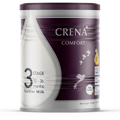
CRENA Comfort Stage 3 tin
CRENA Comfort

Gentle Relief for
Sensitive Tummies.

Built on our gentle AMF base, this specialized formula is enriched with OPO smart fat and enhanced prebiotics—inspired by breast milk—to help support your baby's developing digestive system.

🥇 AMF + OPO 🌿 Enhanced Prebiotics 🧪 Softer Stools

Stage 3: Young Child Nutrition

12–36 Months

Why Choose This Stage?

Happy tummies for active toddlers. Toddler diets can be unpredictable. Stage 3 adjusts protein levels to complement table foods, while the continued OPO and enhanced prebiotics help maintain digestive regularity and comfort during the busy toddler years.

Key Nutritional Highlights

Energy ~521 kcal
Protein 11.6 g (Adjusted)
Fat 28.5 g (AMF + 1.5g OPO)
DHA / ARA 140 mg | ≥160 mg

Preparation Guide

Reconstitution: 13 g powder + water to 100 mL

Instant solubility — no clumping, no fuss

Choose Your Format

Available in three convenient formats to suit your lifestyle.

800g Tin

Best For: The standard everyday size with freshness seal

Preparation: 13g powder + water to 100mL

Find in Store →

The Science of Soothing Digestion

We know that a comfortable tummy means a happier baby. CRENA Comfort goes beyond standard nutrition, utilizing targeted fat structures and enhanced fibres to support gentle digestion.

Smart Fat Structure

OPO for Better Absorption

A specialized, plant-derived fat structure that mimics the natural fats in breast milk. Working synergistically with our prebiotic fibres, OPO helps support your baby's developing digestive system.

Enhanced Prebiotic Fibre

GOS/FOS for Digestive Health

Contains an enhanced blend of GOS/FOS prebiotic fibres inspired by breast milk. Nearly double the standard base for maximum comfort.

The AMF Advantage

Nature's Own Fat Profile

Enriched with premium Anhydrous Milk Fat (AMF)—a naturally occurring milk fat that restores the familiar lipid profile found in breast milk.

Clean Label

Instant Solubility

Crafted without palm oil or soy, using gentle sunflower lecithin. Dissolves instantly with no clumping, no fuss.

Is CRENA Comfort the Right Fit?

Explore our tailored ranges to find the exact nutrition your baby needs.

FeatureCRENACRENA ComfortCRENA Neuro-ComfortCRENA Ultimate
Best ForEveryday complete nutritionSensitive tummies & softer stoolsAdvanced Brain + Gentle TummyThe complete premium suite
Protein TypeIntact (60/40)Intact (60/40)Intact (60/40)Intact (60/40)
Key Fat ProfileAMFAMF + OPOAMF + OPOAMF + OPO
Prebiotic FibreStandard GOS/FOS (1.26g)Enhanced GOS/FOS (2.19g)Enhanced GOS/FOS (3.29g)Enhanced GOS/FOS (3.29g)
Premium BioactivesStandard DHA/ARAStandard DHA/ARAMFGM, HMOs, Elevated DHA/ARAMFGM, HMOs, Lactoferrin, Elevated DHA/ARA
Explore CRENA™ →Explore Neuro →Explore Ultimate →
/* ============================================================ FOOTER — Complete Responsive /assets/css/components/footer.css ============================================================ */ /* ─── Corporate Footer ─── */ .corporate-footer { background: #003366; color: #FFFFFF; padding: 60px 0 24px; margin-top: 60px; width: 100%; } .corporate-footer .container { max-width: 1280px; margin: 0 auto; padding: 0 24px; } /* ─── Footer Grid ─── */ .corporate-footer .footer-grid { display: grid; grid-template-columns: 2fr 1fr 1fr 1.5fr; gap: 40px; margin-bottom: 32px; padding-bottom: 32px; border-bottom: 1px solid rgba(255,255,255,0.08); } /* ─── Brand Column ─── */ .corporate-footer .footer-brand { display: flex; flex-direction: column; } .corporate-footer .footer-logo { height: 48px; width: auto; margin-bottom: 12px; filter: brightness(0) invert(1); } .corporate-footer .footer-tagline { color: rgba(255,255,255,0.7); font-size: 14px; line-height: 1.6; margin: 0; font-family: 'Inter', sans-serif; } /* ─── Footer Links ─── */ .corporate-footer .footer-heading { color: #FFFFFF; font-size: 14px; font-weight: 600; margin-bottom: 12px; font-family: 'Inter', sans-serif; letter-spacing: 0.5px; text-transform: uppercase; } .corporate-footer .footer-links ul { list-style: none; padding: 0; margin: 0; } .corporate-footer .footer-links ul li { margin-bottom: 8px; } .corporate-footer .footer-links ul li a { color: rgba(255,255,255,0.6); text-decoration: none; font-size: 14px; transition: all 0.2s ease; font-family: 'Inter', sans-serif; } .corporate-footer .footer-links ul li a:hover { color: #FFFFFF; padding-left: 4px; } /* ─── Newsletter ─── */ .corporate-footer .footer-newsletter { display: flex; flex-direction: column; } .corporate-footer .footer-newsletter .newsletter-text { color: rgba(255,255,255,0.7); font-size: 14px; line-height: 1.6; margin-bottom: 12px; font-family: 'Inter', sans-serif; } .corporate-footer .footer-newsletter .newsletter-form { display: flex; gap: 8px; width: 100%; } .corporate-footer .footer-newsletter .newsletter-form input[type="email"] { flex: 1; padding: 10px 14px; border-radius: 8px; border: 1px solid rgba(255,255,255,0.15); background: rgba(255,255,255,0.06); color: #FFFFFF; font-size: 14px; font-family: 'Inter', sans-serif; min-height: 44px; transition: border-color 0.2s ease; } .corporate-footer .footer-newsletter .newsletter-form input[type="email"]::placeholder { color: rgba(255,255,255,0.4); } .corporate-footer .footer-newsletter .newsletter-form input[type="email"]:focus { outline: none; border-color: #C47B2E; } .corporate-footer .footer-newsletter .newsletter-form .btn-small { padding: 10px 24px; font-size: 13px; font-weight: 600; border-radius: 8px; background: #C47B2E; color: #FFFFFF; border: none; cursor: pointer; transition: all 0.2s ease; white-space: nowrap; min-height: 44px; flex-shrink: 0; font-family: 'Inter', sans-serif; } .corporate-footer .footer-newsletter .newsletter-form .btn-small:hover { background: #A85F1E; transform: translateY(-2px); } /* ─── Address Bar ─── */ .corporate-footer .footer-address-corporate { padding: 16px 0; border-top: 1px solid rgba(255,255,255,0.08); border-bottom: 1px solid rgba(255,255,255,0.08); margin: 16px 0 20px; } .corporate-footer .footer-address-corporate .address-item { display: flex; align-items: center; justify-content: center; gap: 10px; text-align: center; flex-wrap: wrap; } .corporate-footer .footer-address-corporate .address-item i { color: rgba(255,255,255,0.5); font-size: 18px; } .corporate-footer .footer-address-corporate .address-item span { color: rgba(255,255,255,0.6); font-size: 13px; font-family: 'Inter', sans-serif; } .corporate-footer .footer-address-corporate .address-item strong { color: #FFFFFF; font-weight: 600; } /* ─── Footer Bottom ─── */ .corporate-footer .footer-bottom { border-top: 1px solid rgba(255,255,255,0.08); padding-top: 24px; display: flex; justify-content: space-between; align-items: center; flex-wrap: wrap; gap: 16px; } .corporate-footer .footer-bottom .legal-links { list-style: none; display: flex; gap: 24px; flex-wrap: wrap; padding: 0; margin: 0; } .corporate-footer .footer-bottom .legal-links a { color: rgba(255,255,255,0.5); font-size: 12px; text-decoration: none; font-family: 'Inter', sans-serif; transition: color 0.2s ease; } .corporate-footer .footer-bottom .legal-links a:hover { color: #FFFFFF; } .corporate-footer .footer-bottom .footer-copyright { color: rgba(255,255,255,0.3); font-size: 12px; margin: 0; font-family: 'Inter', sans-serif; } /* ============================================================ RESPONSIVE — Footer ============================================================ */ /* ─── Tablet (1024px) ─── */ @media (max-width: 1024px) { .corporate-footer .footer-grid { grid-template-columns: 1fr 1fr; gap: 32px; } } /* ─── Mobile (768px) ─── */ @media (max-width: 768px) { .corporate-footer { padding: 40px 0 20px; margin-top: 40px; } .corporate-footer .container { padding: 0 16px; } .corporate-footer .footer-grid { grid-template-columns: 1fr; gap: 24px; padding-bottom: 24px; } .corporate-footer .footer-brand { text-align: center; align-items: center; } .corporate-footer .footer-logo { height: 40px; } .corporate-footer .footer-heading { text-align: center; font-size: 15px; } .corporate-footer .footer-links ul { text-align: center; } .corporate-footer .footer-links ul li { margin-bottom: 6px; } .corporate-footer .footer-newsletter { align-items: center; text-align: center; } .corporate-footer .footer-newsletter .newsletter-text { font-size: 13px; text-align: center; } .corporate-footer .footer-newsletter .newsletter-form { flex-direction: column; max-width: 400px; margin: 0 auto; width: 100%; } .corporate-footer .footer-newsletter .newsletter-form input[type="email"] { width: 100%; min-height: 40px; font-size: 13px; } .corporate-footer .footer-newsletter .newsletter-form .btn-small { width: 100%; justify-content: center; min-height: 40px; font-size: 13px; } .corporate-footer .footer-address-corporate { padding: 12px 0; margin: 12px 0 16px; } .corporate-footer .footer-address-corporate .address-item { flex-direction: column; gap: 4px; } .corporate-footer .footer-address-corporate .address-item span { font-size: 12px; text-align: center; } .corporate-footer .footer-bottom { flex-direction: column; align-items: center; text-align: center; gap: 12px; padding-top: 16px; } .corporate-footer .footer-bottom .legal-links { justify-content: center; gap: 16px; } .corporate-footer .footer-bottom .legal-links a { font-size: 11px; } .corporate-footer .footer-bottom .footer-copyright { font-size: 11px; } } /* ─── Extra Small (480px) ─── */ @media (max-width: 480px) { .corporate-footer { padding: 32px 0 16px; } .corporate-footer .footer-grid { gap: 20px; } .corporate-footer .footer-logo { height: 34px; } .corporate-footer .footer-tagline { font-size: 13px; } .corporate-footer .footer-links ul li a { font-size: 13px; } .corporate-footer .footer-newsletter .newsletter-text { font-size: 12px; } .corporate-footer .footer-newsletter .newsletter-form input[type="email"] { min-height: 36px; font-size: 12px; padding: 8px 12px; } .corporate-footer .footer-newsletter .newsletter-form .btn-small { min-height: 36px; font-size: 12px; padding: 8px 16px; } .corporate-footer .footer-address-corporate .address-item span { font-size: 11px; } .corporate-footer .footer-bottom .legal-links { gap: 12px; flex-wrap: wrap; } .corporate-footer .footer-bottom .legal-links a { font-size: 10px; } .corporate-footer .footer-bottom .footer-copyright { font-size: 10px; } }